Color is back—and brighter than ever.
Gone are the days of only white and beige. There are basically no rules now. Couples are leaning into anything that feels authentic and joyful. The best 2026 wedding invitation designs are full of confidence, color, and a clear sense of your story as a couple.

Color is the New Classic
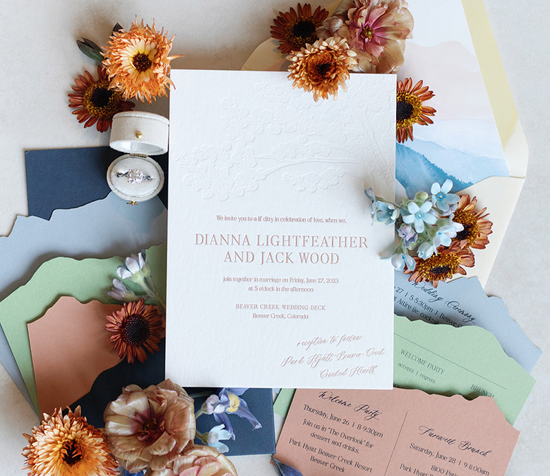
Rich tones, soft pastels, and modern pairings are trending this year. Many couples are mixing unexpected shades for a fun, fresh vibe. A dusty blue envelope with a pop of peony pink? Yes, please.
Looking for inspiration? Go romantic with blush and champagne paired with soft greens for a soft, dreamy feel. Want something bold? Try a citrus-inspired palette with sunny yellow, tangerine, and apricot. For a modern, chic aesthetic, think black and ivory with a touch of metallic gold or sleek slate gray. Earthy tones like terracotta, rust, and olive are perfect for boho or outdoor weddings, while jewel-toned palettes like emerald and sapphire bring a luxe, modern edge. The magic of 2026 wedding invitation colors lies in mixing personality with palette.

Personal, Playful, and Totally You
Your invitations should feel like you. They’re the first peek into your wedding vibe, from romantic winery garden party to rooftop city celebration.
One way to make that happen in 2026? Mix bold color with fun die-cut shapes. Think a sunny yellow pineapple card holding your RSVP details for a tropical, welcome-to-the-party feel. Or a peacock blue, mountain-shaped card that nods to your Colorado-inspired wedding weekend. You can layer these shaped cards behind a more minimal main invitation, or tuck them into a colorful envelope as a surprise moment when opened. Little details like this turn your wedding invitation suite into something friends and family actually want to keep long after the big day.

Let’s Talk Texture
In 2026, texture and color go hand in hand. Think letterpress, embossing, and foil details that make your colors look rich and dimensional. Vellum overlays, handmade papers, and deckled edges add that “I had this custom designed” energy, even in a simple layout.
It’s all about balance. Pair a bold envelope liner or colorful RSVP card with a cleaner main card so nothing feels overwhelming. Play with layering—like a neutral main invite stacked over a saturated backer card—to keep everything chic, modern, and totally frame-worthy.

Color-Shy? 5 Easy Ways to Start
Not a “bold color” person? You can still keep things mostly neutral and add just enough color to make your 2026 wedding invitations feel fresh and modern.
- Add a pop to your envelope liner
Choose a fun color or pattern for the inside of your envelope while keeping the outside soft and simple. It feels playful, but still timeless when it’s on the inside only. - Use color for just one element
If full-color invitations feel scary, add color to only one piece: the RSVP card, a details insert, or your wedding website card. The rest of your suite can stay minimal and calm. - Try “quiet” colors instead of brights
Instead of neon or super-saturated shades, opt for soft pastels or earthy tones. Blush, oat, eucalyptus, and misty blue read sophisticated but still give you that modern, colorful vibe. - Keep the cards neutral, color the envelopes
Print your main invitation in classic black or deep gray on white or ivory, then pair it with colored envelopes. Think dusty blue, soft terracotta, or muted sage for a low-pressure way to try color. - Let your typography do the talking
Keep the background neutral and use a single accent color for names, headings, or a fun script moment. It feels artsy and youthful without tipping into “too much” territory.

Bring It All Together With Color
Color doesn’t just live on your paper goods—it can carry your whole story from invitation to last dance. When you choose a clear color palette for your wedding invitations, you’re setting the tone for everything else: florals, linens, attire, signage, even lighting. That first splash of color in the mail becomes the visual thread that guests recognize again when they walk into your venue and see it woven through the ceremony and reception details.
This is especially fun for destination and experiential weddings, where the location is everything. If you’re getting married in the mountains, deep greens, smoky blues, and earthy neutrals instantly ground your invitations in that landscape. Planning a beach or coastal celebration? Think ocean-inspired blues, sandy taupes, and sunlit coral tones that feel like a mini vacation the moment guests open the envelope. For city rooftops, or modern art museums, you can lean into sleek, saturated palettes—like peacock blue, charcoal, and metallic accents—that mirror your venue’s architecture.
Color also helps guests feel your theme before you ever spell it out in words. A vibrant citrus palette hints at a lively, cocktail-forward party. Soft, romantic tones whisper “slow dancing under string lights.” Moody jewel tones promise a dramatic, candlelit evening. When you use color intentionally across your invitations, day-of stationery, and decor, you’re not just picking pretty shades—you’re designing an experience. And for couples planning destination or highly experiential weddings, that experience starts the second your invitation hits their mailbox.
So go ahead—embrace color! Let your wedding paper goods shine as brightly as your celebration.